
Educacross — Designing for growth in education
A platform redesign focused on onboarding, accessibility, and intuitive tools for teachers, parents, and schools.
Project overview
Redesign of an educational platform focused on improving onboarding and multi-profile access for schools, teachers, and families.
What I worked on:
I led the redesign of core platform areas—especially onboarding—and solved key UX issues related to multiple account access.
About Educacross
Educacross is a B2B educational platform that teaches math and literacy to children using AI-powered games. Schools subscribe to the platform and assign it across classrooms.


Project Kickoff
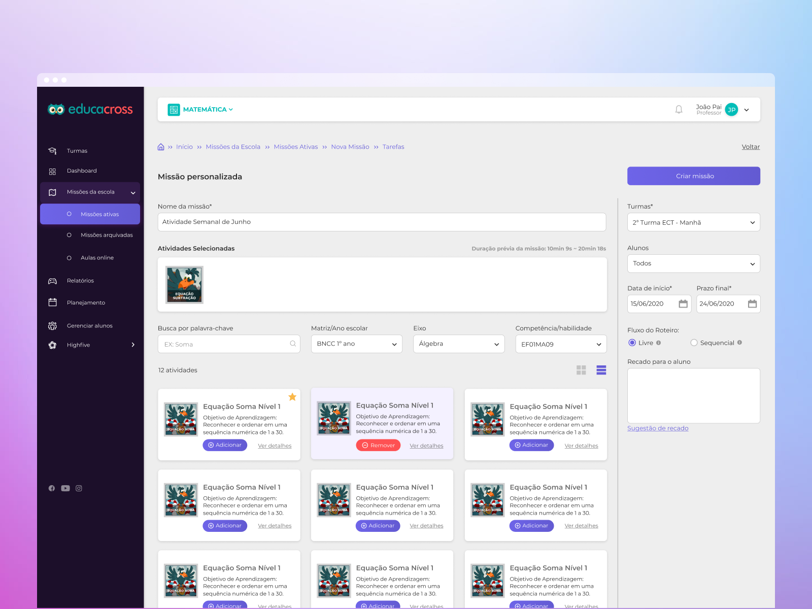
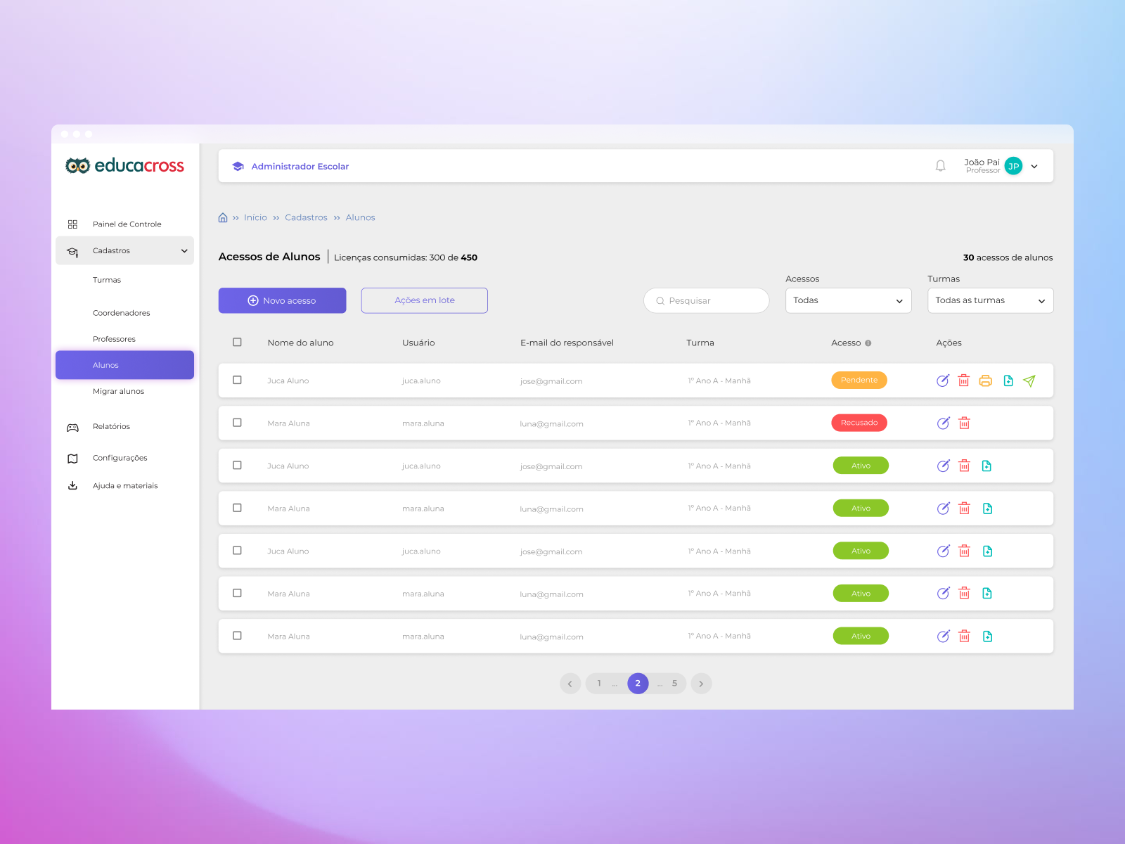
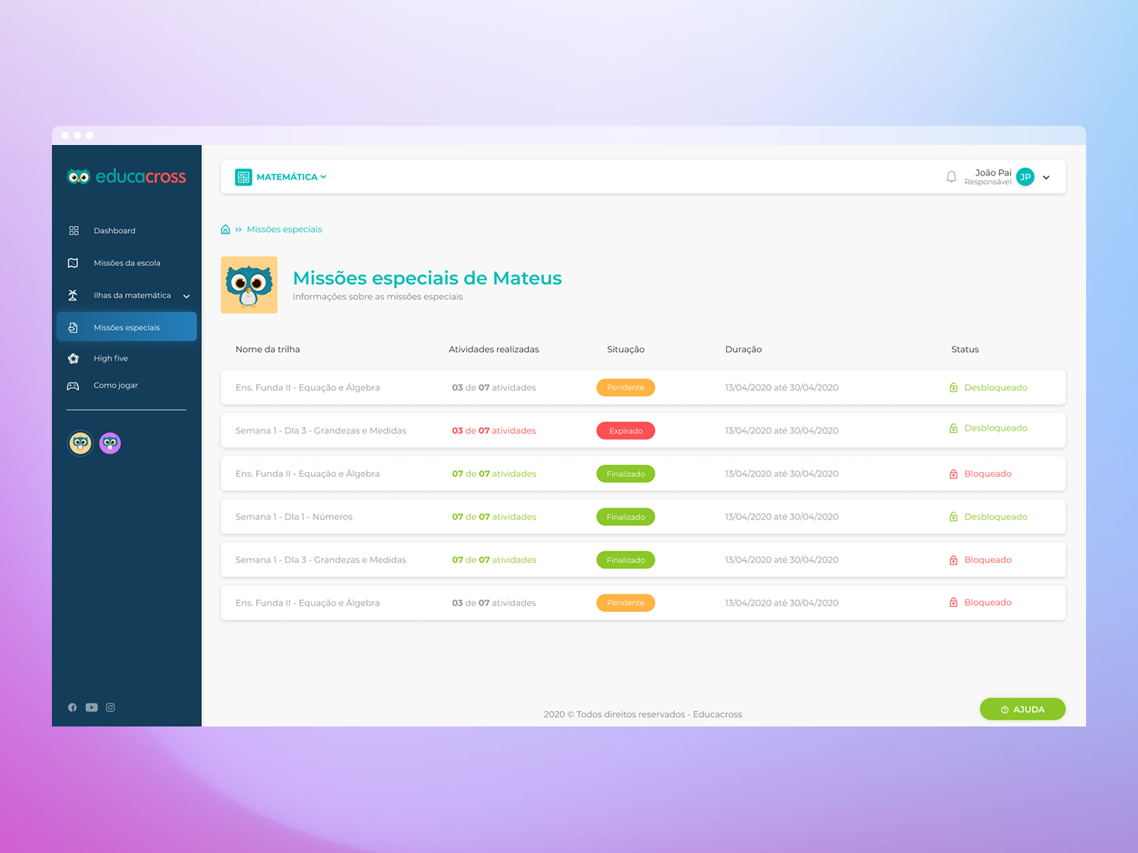
When I joined the project, the platform was undergoing a complete redesign. My main focus was on the teacher dashboard (task creation and student monitoring), the parent area (homework tracking), and the school administration panel (user management and profile editing). The student experience would be handled in a future phase.
To avoid turning the redesign into a mere visual facelift, I suggested starting with qualitative research. We conducted user interviews to uncover deeper needs and identify pain points, particularly in onboarding and usability.
User Research & Interviews
We interviewed around 15 users from different roles—parents, teachers, and school admins—and identified three recurring issues:
- Onboarding Confusion: Many users found the initial access flow unclear, frequently requiring CSM teams to intervene with guided walkthroughs. Support tickets confirmed this was the #1 issue.
- Multiple Accounts Problem: A significant number of users had more than one account (e.g., a teacher who was also a parent), but the platform didn’t allow for seamless switching. Users had to log out and log in manually for each profile.
- Technology Anxiety Among Teachers: Many educators, especially during the pandemic, were using a digital platform for the first time. Complex dashboards with unreadable charts created fear and disengagement instead of support.
The Challenge
Based on the findings, we defined a roadmap:
- First, solve onboarding and multi-account access with a unified and intuitive login flow.
- Then, simplify the UI for non-digital-native educators, focusing on clarity, empathy, and confidence.
Tackling Complexity with Simplicity
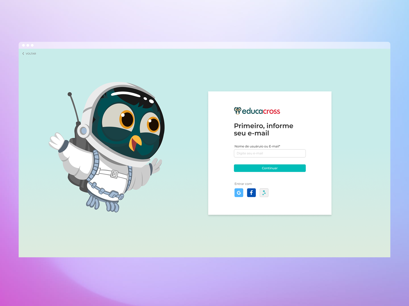
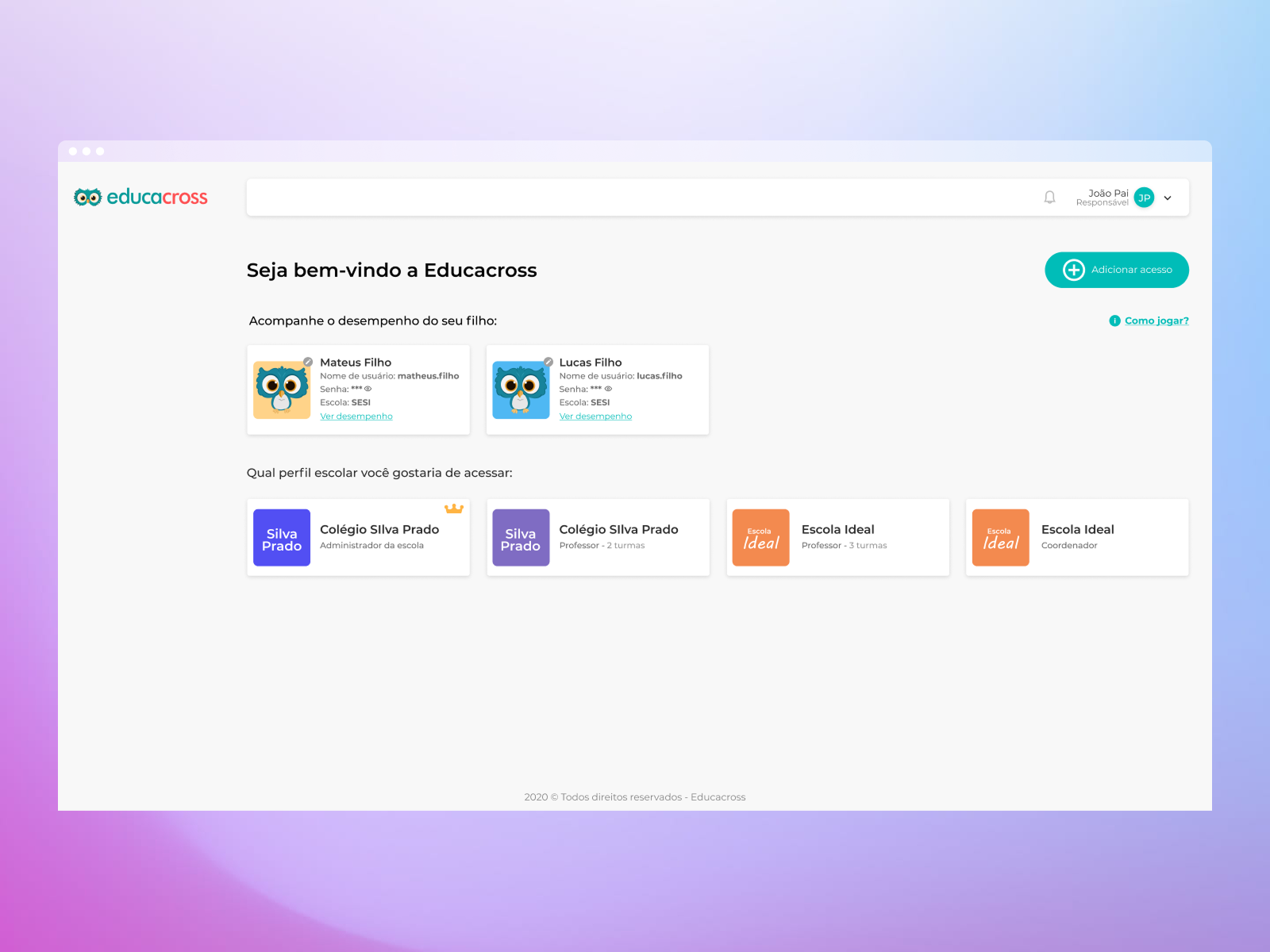
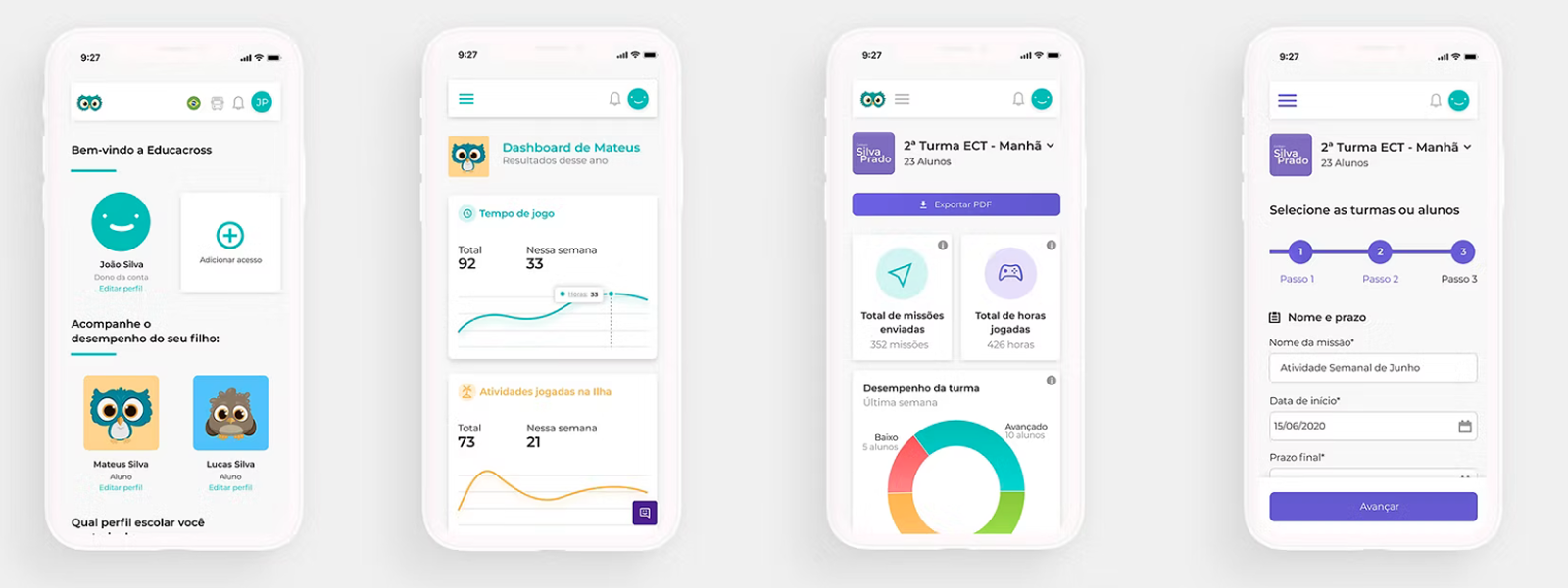
To address the onboarding and account issues, we explored UX patterns from consumer platforms like Netflix and Spotify—tools already familiar to our user base. We then designed an email-based invitation system where users could access the platform, define a password, and use a single login to manage multiple roles. From there, they could choose which profile (e.g., parent, teacher, admin) to access.
This drastically simplified first access and gave users more control. As a result, support requests related to access dropped by 45% after the new system launched.
"Designing for digital beginners meant making every step feel familiar, even for users entering an online platform for the first time."
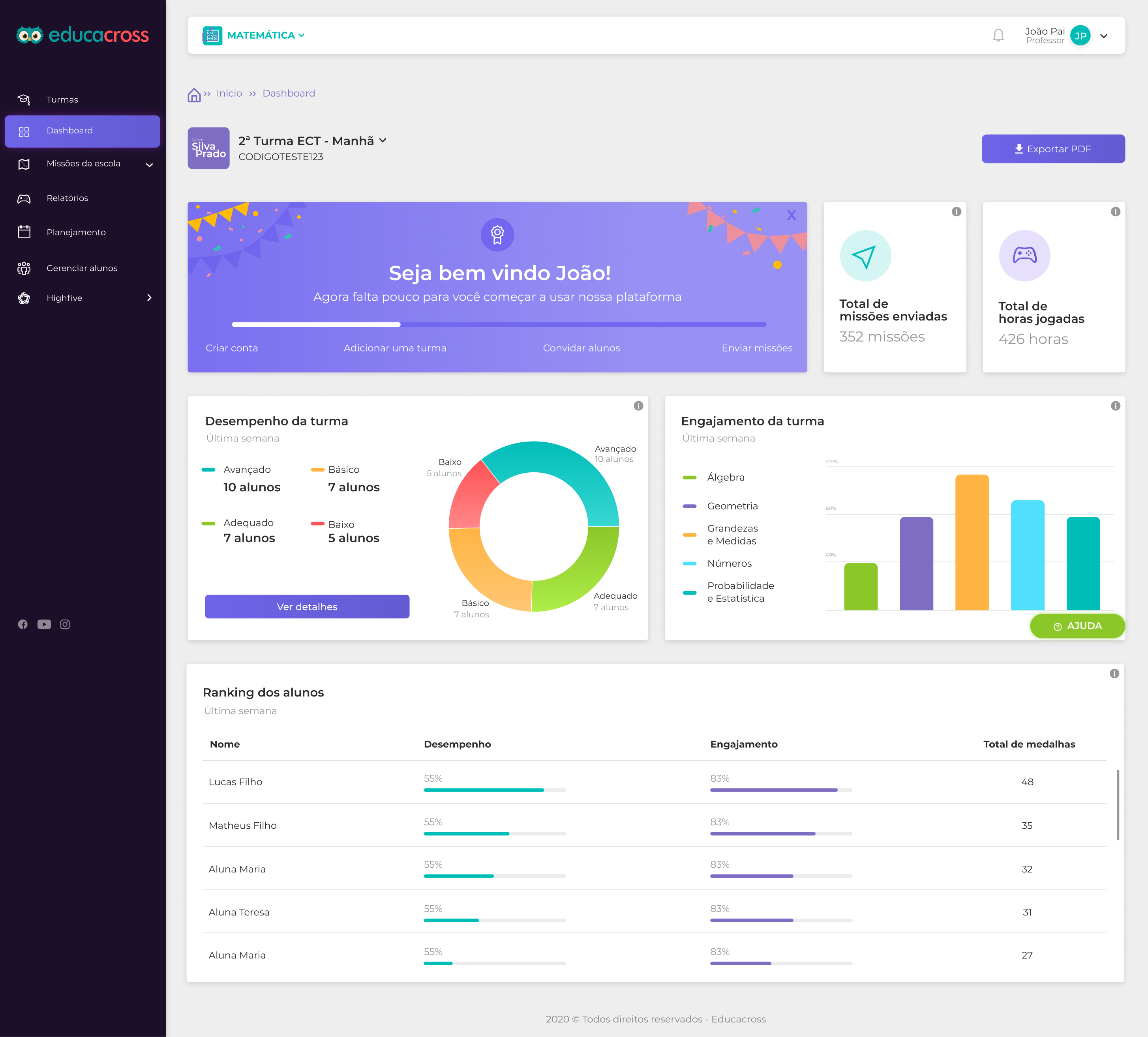
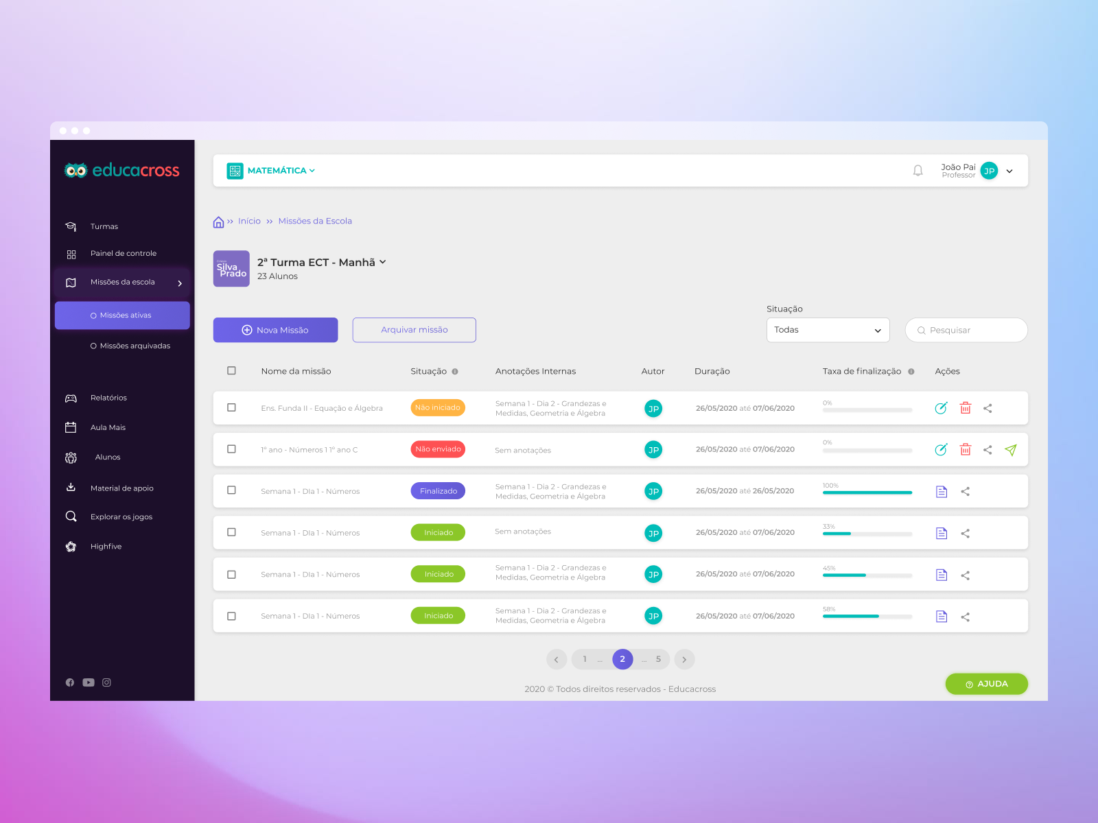
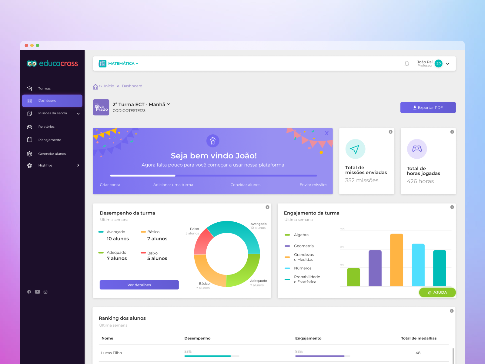
Rethinking the Teacher Experience
Teachers were overwhelmed by complex dashboards filled with analytics they didn’t understand and by a tedious task creation process that raised frequent doubts about game suitability and student targeting.
We redesigned the dashboard to focus only on what mattered most: clear class performance visuals, intuitive color indicators, and minimal cognitive load. The task creation flow was reduced to a single step—select the class, name the task, and choose from a list of games with short, friendly descriptions.
These improvements transformed anxiety into confidence, helping teachers see the platform as a support tool rather than a barrier.
Highlights
- Positive feedback from teachers and school admins highlighted the new interface’s clarity, simplicity, and ease of use.
- 45% drop in support tickets related to onboarding and login issues after launch.
- Educators who were initially hesitant with digital tools reported feeling more confident and empowered.
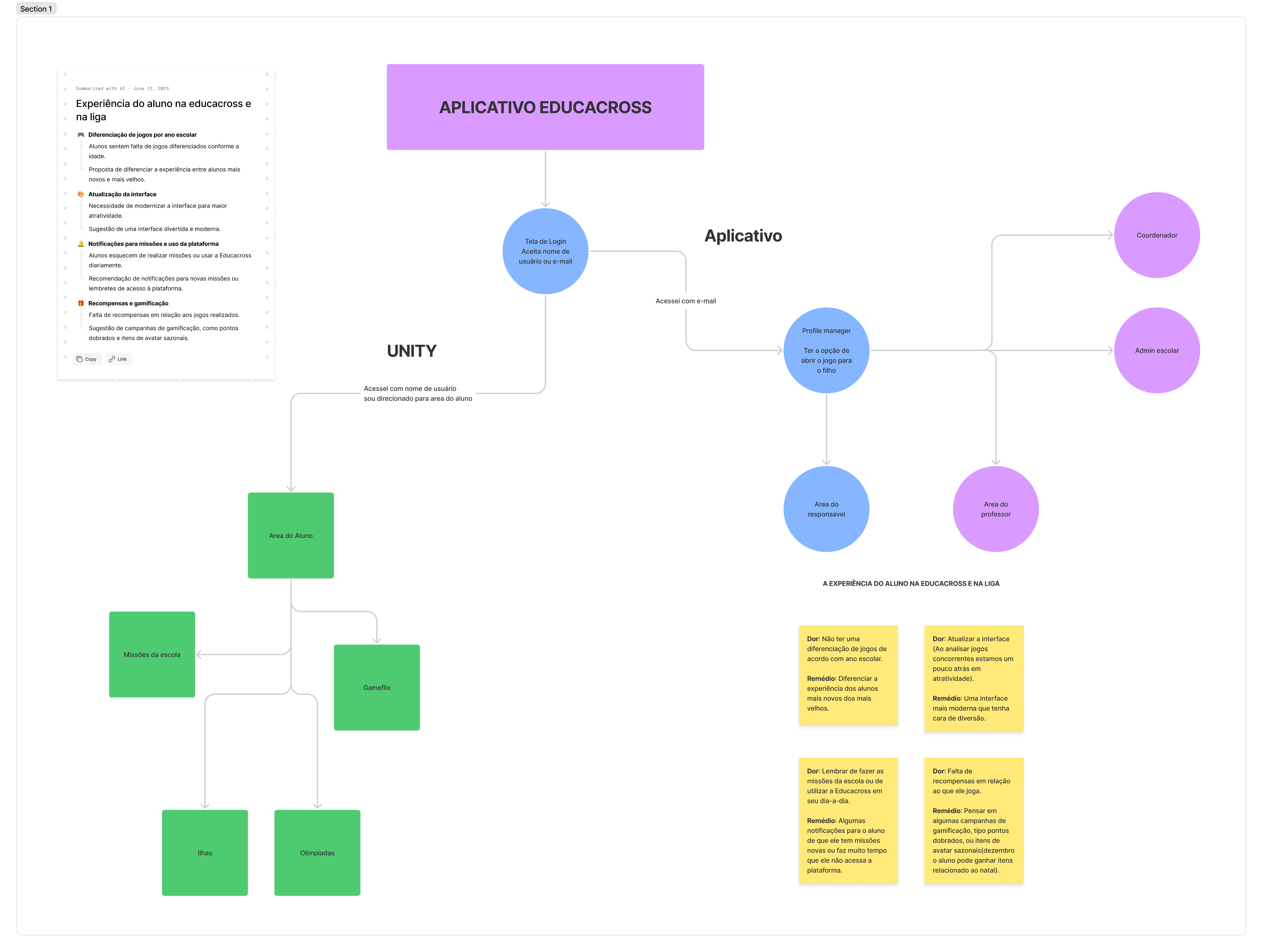
- A coded design system was built as part of the redesign, allowing consistent UI and UX across different user roles (teachers, parents, admins).
- This system enabled faster rollout of future features and streamlined collaboration between design and dev teams.
Old version
New version
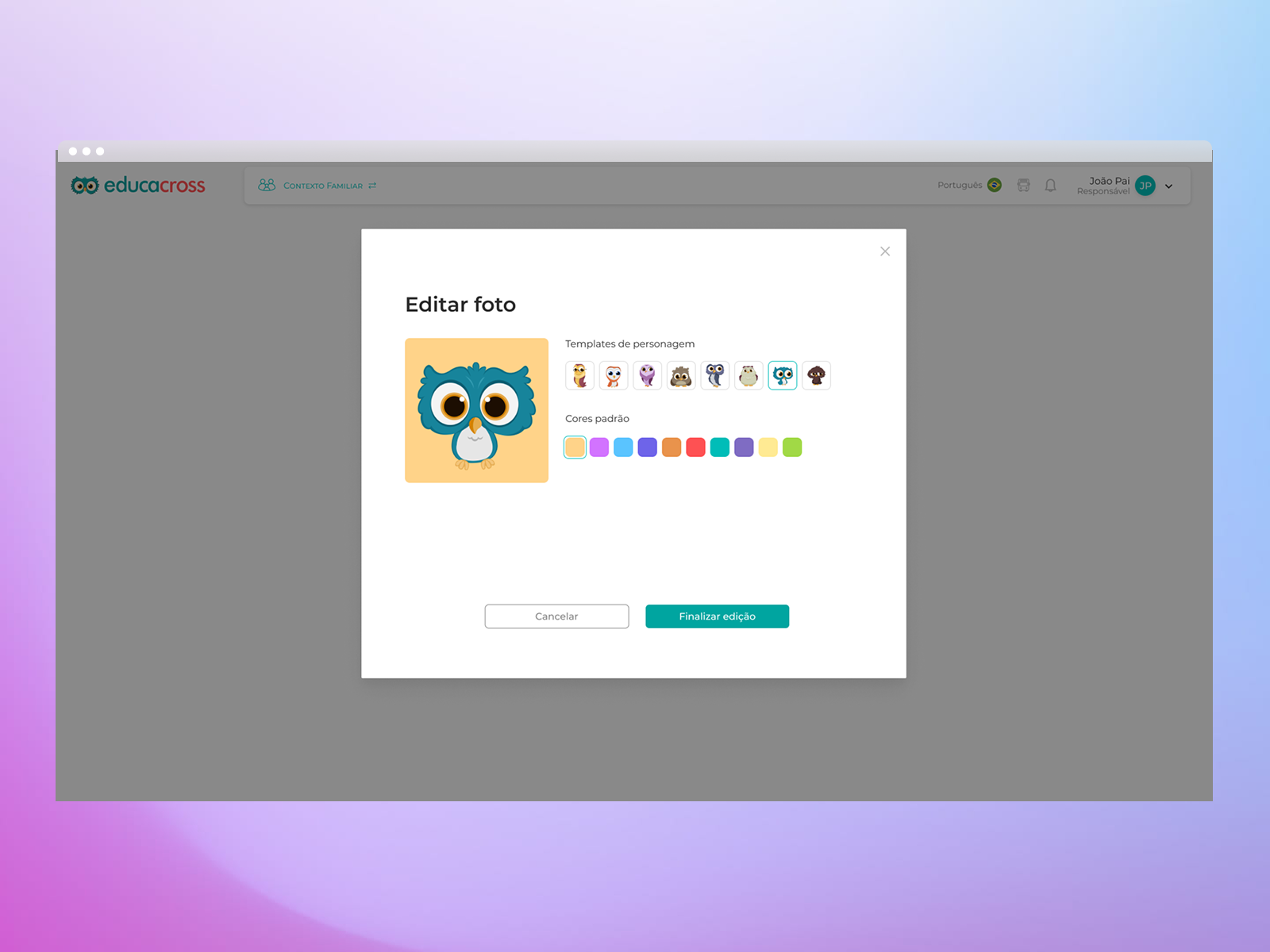
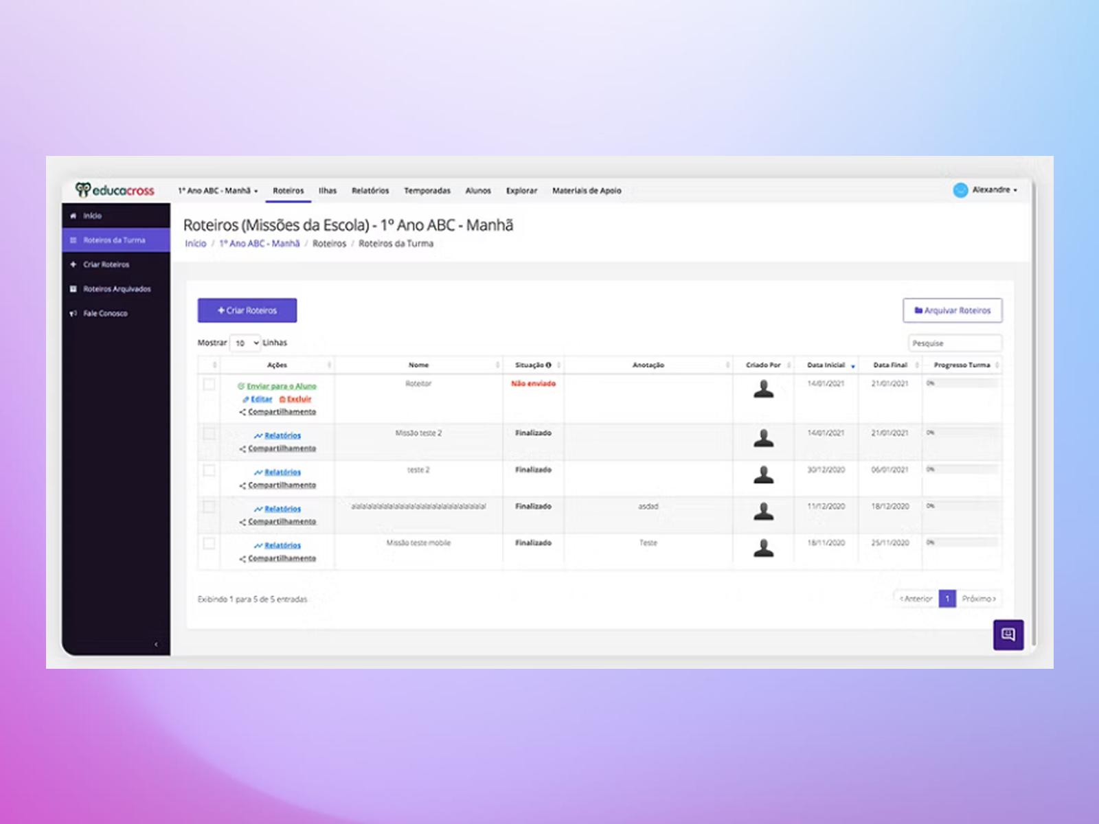
Parent and Admin Area Redesign
In addition to improving onboarding and teacher flows, we also redesigned the interfaces for parents and school administrators. For parents, the goal was to create a simple, welcoming environment where they could easily follow their child’s progress and support their learning at home. For administrators, we focused on enhancing user management and visibility, streamlining tasks such as account control, class tracking, and performance monitoring. These improvements helped make the platform more balanced and functional for all key user groups.
Conclusion
Redesigning Educacross during a critical time for education meant more than just UI changes—it meant creating trust, comfort, and accessibility for a user base that wasn’t tech-savvy. Through research-driven design and a user-first approach, we built an experience that was not only more functional, but truly inclusive for teachers, parents, and schools.
See the next case
Let’s work together


